Popover
The Popover component is used to display additional information or options in a small overlay that appears on top of the current content. It is triggered by user interaction, such as a click or hover, and provides contextual information, actions, or settings without navigating away from the current page.
Usage
- Contextual Information: When you need to provide supplementary information related to a UI element without disrupting the main content.
- Interactive Elements: For displaying options, settings, or actions related to a particular item, such as buttons or links.
- Enhanced User Experience: To offer a clean and accessible way to present additional content or controls, improving the overall usability of your application.
Anatomy
A stepper consists of multiple steps that display completed, in-progress, and pending stages, with connecting lines between steps, along with step descriptions and titles.

Variant
Popover have 2 different style variants.
Light
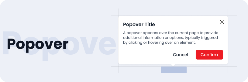
Popover Title
A popover appears over the current page to provide additional information or options, typically triggered by clicking or hovering over an element.
Dark
Popover Title
A popover appears over the current page to provide additional information or options, typically triggered by clicking or hovering over an element.
Sizes
Popover are available in small, medium and large sizes.
Small
Popover Title
A popover appears over the current page to provide additional information or options, typically triggered by clicking or hovering over an element.
Medium
Popover Title
A popover appears over the current page to provide additional information or options, typically triggered by clicking or hovering over an element.
Large
Popover Title
A popover appears over the current page to provide additional information or options, typically triggered by clicking or hovering over an element.
Specifications
Structure and spacing measurements for popover.

Live Demo
The Popover is demonstrated in a live environment in this demo.