Shadow & Blur
Shadows add depth and hierarchy, mimicking real-world light effects. Blur enhances motion, depth, and focus, contributing to a visually pleasing and user-friendly design system. Together, they elevate the overall aesthetics and user experience.

Shadow
Shadows in design systems add depth and hierarchy by mimicking how light interacts with objects, offering visual cues for element prominence and interaction.
Visual hierarchy
Increasing an object's position along the Z-axis gives it more depth, helping users visually prioritise that element over others. Conversely, lowering the Z-axis value makes the object appear flatter and less prominent.

Shadow anatomy
Anatomy of shadow include X-axis, Y-axis, blur, spread and colour.
X-axis
This is the offset of the drop shadow along the horizontal plane or X-axis, which controls the top and bottom shadow.
Y-axis
This is the offset of the drop shadow along the vertical plane or Y-axis, which controls the direction of the right and left shadows.
Blur
This adjusts the blur or feathering of the shadow color.
Spread
This adjusts the size of the shadow to represent the distance between the foreground and background.
Colour & percentage
Shadow depth is defined by the shadow color and its opacity percentage, with darker colors and higher opacity creating deeper shadows.

Shadow varient
Shadow level produces a three-dimensional appearance to an object with shadows and blur applied.
Name
Shadow 1
Blue Varient
#606170 (8%)
#28293D (4%)
Direction(X, Y)
0px, 2px
0px, 0px
Blur
4px
1px
Spread
0px
0px
Example

Name
Shadow 2
Blue Varient
#606170 (8%)
#28293D (4%)
Direction(X, Y)
0px, 4px
0px, 0px
Blur
8px
2px
Spread
0px
0px
Example

Name
Shadow 3
Blue Varient
#606170 (8%)
#28293D (4%)
Direction(X, Y)
0px, 8px
0px, 2px
Blur
16px
4px
Spread
0px
0px
Example

Name
Shadow 4
Blue Varient
#606170 (8%)
#28293D (4%)
Direction(X, Y)
0px, 12px
0px, 2px
Blur
12px
4px
Spread
0px
0px
Example

Name
Shadow 5
Blue Varient
#606170 (12%)
#28293D (8%)
Direction(X, Y)
0px, 20px
0px, 2px
Blur
32px
8px
Spread
0px
0px
Example

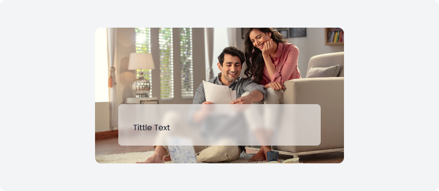
Blur
Blur softens the appearance of UI elements, creating depth, focus, or hierarchy. It can be applied to backgrounds, images, or specific components.
Blur anatomy
Anatomy of bur include background blur value only.
Blur
This adjust the background blur of the image.

Blur varient
Blue has small, medium, and large variants for different visual impacts and emphasis in design elements.
Name
Background Blur
Example
Small
8

Medium
16

Large
24

Shadow usage
Shadows serve several important purposes:
- Showing hierarchy in content, whether it's at similar or different levels of elevation/distance.
- Adding depth and drawing attention to surfaces at rest or in motion.
- Emphasising surface edges by contrasting them with their surroundings using shadows.
Shadow 1
Use Shadow 1 for objects positioned very close to the surface, such as the top bar.

Shadow 2
Apply Shadow 2 when an object is positioned at a low level. For example: bottom sheet

Shadow 3
Use Shadow 3 for objects at a medium level, like the bottom sheet.

Shadow 4
Apply Shadow 4 when an object is positioned at a high level. For example: calendar

Shadow 5
Apply Shadow 5 when an object is positioned at a very high level. For example: dialog boxes

Blur usage
There are several use-cases of blur
- Use blur to ensure that foreground elements, such as dialog boxes, pop-ups, or tooltips, stand out against a detailed background.
- Blur the background when a modal window is active to keep the user's attention on the modal content.
- Blur the main content when navigation menus or side panels are open, helping users focus on the available options.
Small
Apply a small blur to create a subtle sense of depth and focus.
Medium
Apply a medium blur to create a moderate sense of depth and focus.

Large
Large blur to create a pronounced sense of depth and focus.
